7 things you should
know how to do in photoshop (don’t worry, there will be more)
This tutorial will show you a few tips that I tend to use
really often. If you have a mediocre photo, try some of these and maybe it will
become less mediocre, or if you have a great photo this could improve it even
more.
Also, keep in mind that these do not have to only be used on
portraits, or all used together. They can all be used for other pictures and
can all be used separately.
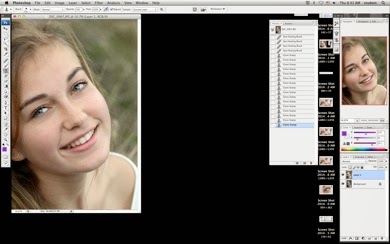
To start, open your image in photoshop.
FIRST DUPLICATE YOUR
LAYER by pressing command+j
If you do not do this,
you will regret it
Tip 1:
command+shift+L
This is auto levels. It will adjust the color or levels of
your photo, usually making it 10 times better. Sometimes, however, photoshop is
not as smart as we wish and it will be bad.
On this photo, this command is great
Tip 2: Burn tool
The burn tool is kind of a brush that darkens your exposure
in the spots you brush it over. On a picture like this, I usually use it on
eyelashes or shadows to make the photo more dramatic. Be warned: It will look
horrible if you try to significantly change anything, so be sure to set the
exposure to no more than 10%
Also, set the range to shadows if you plan on darkening
shadows (usually has the best effect)
If you want to darken highlights, change it to highlights
This is the difference between one eye burned and one eye
not
Both are burned now, which helps direct attention more to
the eyes.
Tip 3: Dodge tool
The dodge tool is the exact opposite of the burn tool, it
will lighten the areas you brush over
I usually use this on catchlights in the eyes (the
reflections of light) which are usually what makes a good portrait a good
portrait.
Here, I set the mode to highlights because that is what I
will be lightening.
The left eye is dodged, the other not yet
THIS is what will happen if you are overzealous with the
tool, so be warned. Unless of course this is the look you are going for.
Tip 4: Sponge tool
This tool is another brush that will either draw out the
colors in something, or desaturate them.
I will use it on Daphne’s eyes to make the blue/greenness
come out even more
Make sure the mode is on saturate, unless you want their
eyes to look dead or gross
Here is the final effect:
Tip 5: clone stamp
tool
This tool can copy one part of the picture and stamp it on
another. This tool here was used for when (god forbid) someone has a pimple or
to correct under eye bags, but it can also be used to cover up a distracting
part of the background, make Daphne have four eyes and much more.
To make a selection
of what area will be stamped onto other areas, hold down alt while clicking
somewhere on the photo. Here I used an opacity of about 20% so that the stamp would
not be obvious. If needed, you can continue to stamp over an area until it is
covered.
Here is the final product of
using the clone stamp tool as a skin corrector.
Tip 6: Curves
The curves tool in photoshop
changes the tonal values of the picture. Command+m will bring up the dialogue
box:
Here I made a small S curve
which will slightly increase contrast and make the picture look better (I
think).
Below is what will happen if
you make it to strong. If you like this look go for it, but usually it won’t
win you any prestigious awards (although go ahead and prove me wrong)
Tip 7: Lasso/darkening
The lasso tool is a selection
tool. This tip will focus the attention of the viewer on whatever happens to be
the subject of the image. To do it, set the feathering of the lasso at at least
250 pixels, but 300 if you can. This will make the change gradual as opposed to
a line from light to dark.
Draw a rough circle around
your subject (leaving room to spare)
First hit command+shift+I to
inverse your selection, then pull up the curves box again (command+m) and just
pull down the shadows a little bit. This will darken the surrounding area,
which will draw your eye to the subject.
Here is the final image, after all these steps. Below you
can see the comparison of before and after. These tips are some of the ones I
use often to improve images, and they do make a big difference.